
So what exactly is this card game?
Remember fill-in-the-blanks during school? This is the grown-up version, but with a lot of fun!
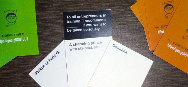
Cards Against Humanity is a party game that became popular very quickly. It is available under a Creative Commons license. But it’s NSFW!!
What if I create a “safe for work”, but still funny version covering startups, developers, WordPress? What if I went all the way and included India and Bollywood too??
That was an irresistible itch to scratch! So I tried it. Collected, edited, wrote and created a set of cards. Then tested the game with my team.
They couldn’t stop laughing.
How to download / get the game?
Few options:
“Indian” version
You can download a PDF of the Indian flavour of this game. Get it printed on A3 sized 300gsm card sheet. Cut them to size and you’ll have 126 white cards, and 126 black cards on their back.
International edition
Download part 1 – with 64 black and 64 white cards, and part 2 – with extra 32 white cards. Get them printed, cut to size. You will have 64 black cards and 96 white cards.
I got these cards.. So how to play them?
Different editions have slightly different number of cards, so instructions differ slightly. But the main game play is same – and simple.
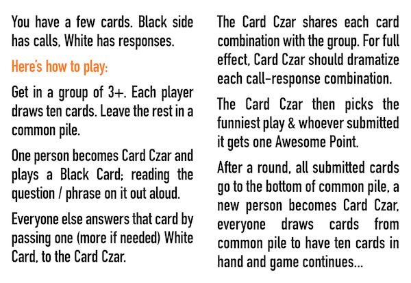
To start the game, get into a group. Then each player draws ten White Cards.
The most horrible person begins as the Card Czar and plays a Black Card; and reads the question or fill-in-the-blanks phrase on the Black Card out aloud.
Everyone else answers the question or fills in the blank by passing one White Card, face down, to the Card Czar. If the Black Card mentioned “Pick 2” or “Pick 3”, each player submits that many White Cards in the order the Card Czar should read them.
The Card Czar shuffles all the answers and shares each card combination with the group. For full effect, the Card Czar should re-read (in their own style) the Black Card before presenting each answer. Everyone else should make a vivid picture in their mind of what the Card Czar is saying.
The Card Czar then picks the funniest play, and whoever submitted it gets one Awesome Point.
After the round, a new player becomes the Card Czar, used cards go to the bottom of the common card pile, and everyone draws back up to ten White Cards.
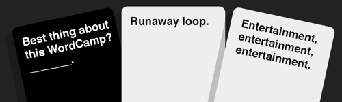
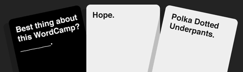
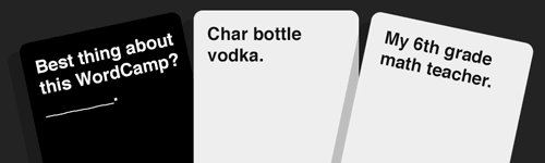
Instructions for playing Cards Against WordPress at PressNomics 5.
Advanced Rules
Refer to the CAH official rules PDF. There is detailed description of advanced rules in there.
No Offense please!
This is strictly for fun. Don’t take offense. Play it once and you’ll realize!
Credits, Legalities etc.
- The whole game is based on Cards Against Humanity.
- All trademarks and copyrights of their respective owners.
- Thanks to CardCast and the community there for creating awesome card collections. I picked many from there.
- Icons from The Noun Project.
- Cards Against WordPress – Great effort. I picked a few cards from here as well! Props to @mt_Suzette, @JackMachin, @philipjohn, @dustyf, @juliekuehl, @TechVoltz, @evansobkowicz, @mattmedeiros, @marktimemedia, @add_action_dan and others!
- Phil Hyot’s WP Against Humanity!
- The Bigger, Blacker Cards Ruby script to create a PDF of your own cards. My first time hacking around Ruby!!
- India and our own Bollywood – for inspiration 😉
- My fun-loving teams of StoreApps, Putler and Icegram – for happily being guinea-pigs during my experiments!
- Anish Nair – for the photographs!